

The tools we use to analyse data play a pivotal role in shaping investment decisions. Is it possible that cognitive bias can creep in when we favour sensitivity tables over histograms? This article delves into the contrasting aspects of sensitivity tables and histograms, exploring their strengths and potential pitfalls.
The Power of Sensitivity Tables
Sensitivity tables are commonly used in the real estate industry to assess how changes in rental growth and exit yield can affect the return on an investment. They offer a structured and methodical approach that can be reassuring to investors. Essentially, sensitivity tables help us understand the potential scenarios that can impact our investments:
- If rental growth exceeds expectations or the exit yield is lower than anticipated, the investment may yield a higher return.
- Conversely, if rental growth falls short of expectations or the exit yield is higher, the return on investment may be lower.
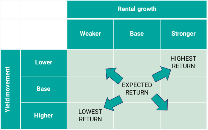
However, we need to tread cautiously. While sensitivity tables provide valuable insights, there are potential pitfalls to consider. These tables can inadvertently lead to cognitive bias by emphasising a limited set of scenarios and variables, leaving little room for manoeuvre when considering the broader impacts on a portfolio. This tunnel vision can skew our perception of risk and diversification.
The Symmetry Illusion of Sensitivity Tables
One cognitive issue with sensitivity tables is that their symmetrical layout implies an equal likelihood of all permutations of rental growth and exit yield.

In practice, some outcomes are more probable than others. Rental growth and exit yield do not operate in isolation, and their relationships can be complex. For instance, we often observe that:
- Rental growth tends to be high when yields decrease.
- Rental growth tends to be low when yields increase.
The occurrence of good and bad combinations simultaneously is less common.
The likelihood of each outcome depends on the distribution and correlation between rental growth and yield changes. Understanding these relationships is crucial for making informed investment decisions.
Correlation in Real Estate Analysis
The correlation between variables like rental growth and exit yield is a critical factor to consider. Correlation measures the strength and direction of the relationship between two variables. In the context of real estate, a positive correlation suggests that when one variable (e.g., rental growth) rises, the other (e.g., exit yield) tends to rise as well, and vice versa. Conversely, a negative correlation implies that when one variable increases, the other tends to decrease, and vice versa.
For example, empirically there has been a correlation of -0.69 between rolling 5-year retail rental growth and yield movements since 2000. This indicates that as rental growth increases, retail yields tend to decrease, and vice versa. Such relationships are challenging to represent in a sensitivity table, making it essential to look beyond this tool to gain a comprehensive understanding of these dynamics.
Histograms: A Comprehensive Perspective
Histograms provide a visual representation of the full distribution of potential returns, allowing investors to understand the entire range of possibilities. Instead of focusing on a limited set of scenarios, histograms display the broader landscape of outcomes.
Moreover, histograms enable us to consider the impact of a property on portfolio returns. In real estate portfolios, where multiple properties are involved, the return distribution tends to converge around the average. This means that the more properties in a portfolio, the narrower the range of potential returns. Think of it as the law of large numbers in action, where the average return becomes a more reliable indicator.
Seamless Transition to Portfolio Risk Assessment
One of the strengths of histograms lies in their ability to facilitate a seamless transition to exploring the impact of individual properties on portfolio risk.
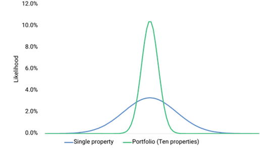
By visualising the entire distribution of returns, investors can identify how each property contributes to the overall portfolio performance, allowing investors to make more informed decisions regarding portfolio diversification and risk management.
Conclusion: Balancing Tools for Informed Decisions
Sensitivity tables have their place in helping us understand the potential impact of variables like rental growth and yield on individual investments. However, it’s crucial to recognize their limitations, particularly in handling complex correlations and providing a holistic perspective on portfolio risk.
Histograms, on the other hand, offer a comprehensive visualisation of data, allowing us to grasp the entire spectrum of possibilities. They provide a more transparent view of how properties influence portfolio returns and risk. To make well-informed decisions, real estate professionals should consider a balanced approach, using both sensitivity tables and histograms to gain a holistic understanding of their investment portfolios.