

Short post today.
This is just a fun chart that (a) speaks to the difficulty of forecasting, and also probably (b) the incentives inherent to sell-side research.
Earnings estimates (the coloured lines) are almost always revised downwards:
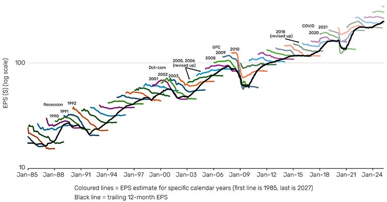
The downward slope of the colored lines reflects downward EPS revisions for each calendar year, going back to 1985.
It’s a fun chart to stare at.
The three exceptions (where analysts made upward revisions) are:
- ‘05 and ’06, where analysts were surprised by market buoyancy (and we know how that turned out);
- 2018 when Trump’s tax cuts kicked-in—2018 was also a down-year for the market, ironically enough.
Here’s another way of looking at the history of EPS revisions, this time emphasizing that the biggest revisions tend to be recessionary or recession-adjacent:
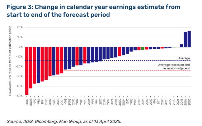
1986 and 1987 had big downward revisions without accompanying recessions.
But normally, when analysts get it really wrong, it’s because bad stuff happens (which analysts failed to predict).
Over the longer term, if you can predict earnings, you can predict the direction of the stock market. It turns out, however, that predicting earnings is awfully hard.
This article was originally published on Random Walk.